
Phi is often applied in product logos.
From Renaissance artists of the 1500’s to graphic artists of today, phi is recognized for its ability to give a sense of aesthetic appeal in balance and harmony of design. Product logos represent an image that must make a positive and memorable impact on the conscious and subconscious minds of consumers, so it is no surprise to find phi proportions in many logo design of major companies. The Phi grid proportions are provided by PhiMatrix software. See other examples of logo design at the PhiMatrix site.
Note: The logos presented on this page are for illustration purposes only of principles of graphic design and are do not imply in any way an endorsement of, or affiliation with, this web site or its affiliate web sites by the companies shown.


Note how every dimensions of each letter of this logo is apparently based on proportions of phi (first golden ratio) or phi squared (second golden ratio):
![]()

Phi is also used in the proportions of product design, as illustrated by these soft drink bottles:
![]()

Pepsi’s ad agency did the redesign of the Pepsi logo above by applying concepts of Phi and the construction of the Golden Section. Read it in a 4MB PDF HERE.
In 2015, Google did a redesign of its logo, icons, website layout and more. My article Google Logo and the Golden Ratio in Design shows how the golden ratio was applied to bring harmony throughout all their design elements.
Most companies that apply phi to their logos apply it to the proportions of the logo. What do you do if your logo is simply your company name? Look at the logo below and see if some of the most creative minds in the world of entertainment have found a very creative way to apply phi:
![]()

Do you see it? Note from the Phi Symbol page the upper and lower case of phi:
Upper case Phi is Φ and lower case phi is φ.
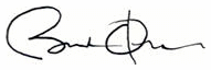
Also in the category of potential appearances of Phi, look at the signature of President Barack Obama and ponder why the line for the b is through the O instead of to its right:

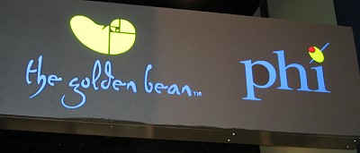
And then there are other creative uses of Phi and the Golden Ratio in marketing, such as a coffee shop called the Golden Bean and a bar called Phi, signatures of Hotel Indigo, which uses a nautilus shell as its logo. Note the golden spiral construction on the bean:
 |  |

