The golden ratio is Stephen Silver’s secret weapon of character design.


Stephen Silver Golden Ratio in Character Design video
Stephen Silver is a character designer and art teacher who has designed characters for Disney Television Animation, Sony Feature Animation and Nickelodeon Animation. In this role he has designed the style of the shows such as “Kim Possible”, Kevin Smith’s “Clerks” the animated series, “Danny Phantom” and many others. He is also the author and artist of seven books on the art of character design, caricature, sketching and life drawing. In addition to his freelance work and lectures, he owns an art school called Silver Drawing Academy in Simi Valley, CA. He has two online character design courses online at www.schoolism.com. Those are some great credentials. And what does he say is his “secret weapon” for character design? Yes, it’s the golden ratio.
The golden ratio is flawless because it gives the “small, medium and large” that design is built upon.
He describes the golden ratio is just perfect, flawless, ideal and brilliant because it gives you the “small, medium and large” components of a character or object. He notes, “that’s what we really build design on, because we’re so used to seeing it in the human face and everywhere we look in trees and animals.” It can be used for any kind of design, including:
- Character design
- Prop design
- Environmental design
- Building design
- Architectural design
- Clothing design, and
- Graphic design
The golden ratio stops him “from drawing things and making things so even.” He’s coined this term “avoiding the ladder” to describe the tendency to create identical spacing in design and composition. “That’s what you want to avoid in your design,” he says, “so you don’t make everything feel so ordinary.” Without this “it becomes almost too rhythmical when it’s not supposed to be. We want to have more versatility,” he says.
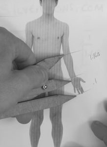
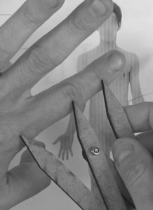
Stephen illustrates the concept by showing in his video how the golden ratio can be found in the body sections of insects and features of the human face and human body. These are the same principles shown on GoldenNumber.net since its inception in 1997.


Cartoon characters designed by famous artists with the golden ratio in mind.
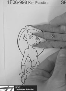
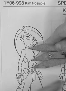
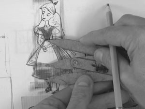
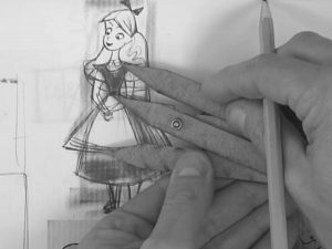
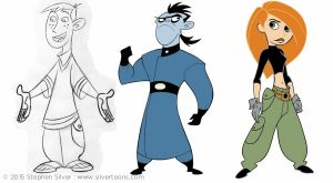
Stephen illustrates in his video how he applied the golden ratio in his design of characters such as Kim Possible.
He notes too how golden section appears in the Fred Flintstone character created by Ed Benedict. Note in the photo on the right where he illustrates above the head that a nose that was instead 50% of the width would not seem as natural:
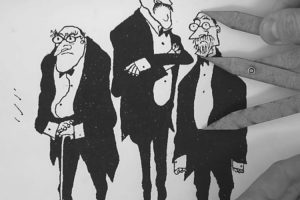
Stephen comments that many other designers use the golden ratio, some by direct application of a golden mean gauge and others by their innate sense of design in nature. Maintaining those natural proportions is the difference that makes them good designers. He shows several characters by well known designer Tom Oreb (Sleeping Beauty and others) and by famous artist/designer Ronald Searle, whose characters reveal the same proportions. Stephen says, “It works! It works, and it’s a beautiful thing!”
Create a rough version of your composition first to get the feeling and use the golden ratio to refine it.
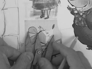
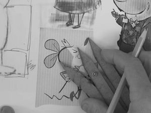
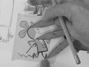
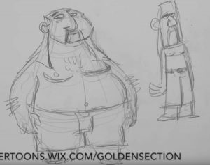
Stephen goes to the drawing board to create a rough design like these:
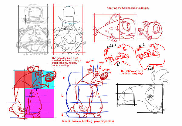

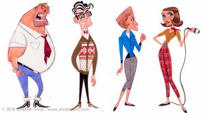
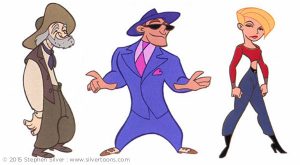
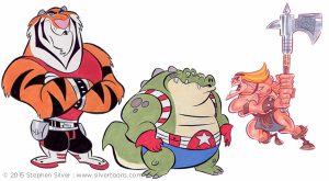
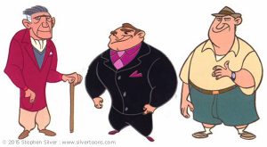
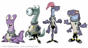
He then applies his secret weapon (and other talents) to refine an amazing array of unique characters and animals for TV, animations and movies, such as these:
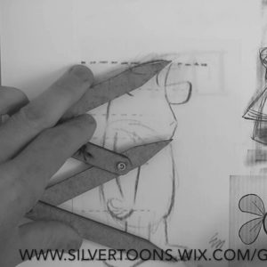
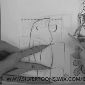
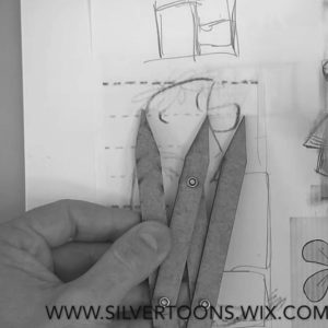
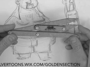
In designing a character, Stephen says that the most important thing is to first get your idea out, to think about who your character is. Get a loose concept first to find the feeling of the character. Then begin applying the golden ratio to make adjustments to the various proportions of the character to make it feel more ideal. He illustrates this concept with two characters he creates in the video. He starts with some rough first passes to get the overall shape and feel. He then refines their proportions to golden ratios in various features. Note in the illustrations below that the original sketch lines are slightly off from the final drawing. The refinements below include the waistline and length of the pants, the length of the goatee and the position of the pectorals. He does all of this quickly and simply, using the golden mean gauge he created, at right, for this purpose.
He says, “It’s not that if you don’t do it this way that all your drawings are going to fail,” but “it’s a great weapon to have on your side.”
Disney uses Phi in their animations and even in their logo.
Stephen was not the only one at Disney who thinks that the golden ratio, represented by the Greek letter Phi, is something special. Did you ever notice that the design of the Disney logo itself uses an upper case Phi (Φ) to dot the I and a lower case phi (φ) for its unusually styled Y? Now you’re in on the secret!
![]()
Learning more and getting the tools you need to design is easy.
Stephen’s website and courses have more information on all of this. He sells a signed copy of his gauge for $10 plus shipping to anywhere in the world. He concludes, “It really works, it’s cool and it’s a beautiful thing.”
For those of you who work with digital images, you may find that my PhiMatrix golden ratio design software can help you to accomplish the very same things, whether that be in characters, logos, user interfaces, products or any other kind of design.
Stephen Silver YouTube video “Art Lesson – How to use the Golden Section for Character Design” below:

References:
Stephen Silver Silvertoons website
Stephen Silver Golden Mean Gauge site
Stephen Silver Classes at Schoolism