
Abstract
Several recent studies have attempted to rate the beauty of objects (cars, buildings) by mimicking an analysis technique created for facial analysis. While these efforts are very creative and involved a lot of work, they fail to produce reliable results for two reasons. First is that human faces have a common set of features that can measured against a standard, while the objects of the study do not. Second is that the studies did not actually measure golden ratios, which in geometry and visual aesthetics are based on dividing a line segment at its unique golden ratio point. The studies instead calculated the ratios of all possible permutations of two line segments created by each combination of three marker points. The object whose mathematical average of all the ratios came closest to the number 1.618… (or its reciprocal 0.618…) was declared “the most beautiful according to science and the golden ratio.”
Since the objects identified as the “most beautiful” by the model were clearly not the most beautiful by any human judgment, the model is not evidence-based and not really science. Since it did not really use the classic definition of a golden ratio in the process of getting there, the results are not really “according to the golden ratio.” This article discusses the details of the study and discusses where the golden ratios actually appear and how they can be used in understanding nature and applied in the design arts.
Can beauty be defined by science and the golden ratio?
As a researcher, author and software developer on the Golden Ratio, I’m always very interested in stories announcing new discoveries or insights on the topic. I was thus very intrigued to find a March 2021 article in the UK’s Daily Mail announcing that UK’s Roofing Megastore had identified “The World’s Most Beautiful Buildings, According to Science and the Golden Ratio.”
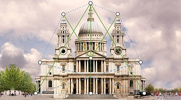
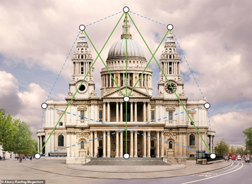
I read the articles, and learned about the methodology they had used. The team that performed the study did a lot of hard work. They found candidate buildings, identified key markers and gathered many measurements. They then used a custom software program to develop a mathematical score to rank the beauty of each of the buildings. And when the work was done, they identified St. Paul’s Cathedral of London as the most beautiful building in the world:

But science requires good evidence-backed findings
In February 2020 though, I was similarly excited to see that Carwow had published an article on the “Best-looking cars of the last decade.” In this article, Carwow claimed to apply golden ratio analysis techniques used for human faces to the front-end view of automobiles. Very creative indeed! Unfortunately, my in–depth review of the Carwow study revealed that while the Carwow team had been very ingenious and detailed in their work, their methodology was fundamentally flawed. It had nothing to do at all with the way that humans perceive the golden ratio. It was based instead on an exercise in mathematical number-crunching that no human brain would use.
The results were highly suspect too. Of the 626 cars produced from 2010 through 2019, the unappealing 2016 Smart ForTwo Cabrio took the very top spot. Even the Carwow team agreed that this very utilitarian-looking car ranked very low in their personal ratings of beautiful cars. Their innate perceptions of beauty yielded very different results than their mathematical model. This was a very clear indicator that the model was flawed. There was really no basis at all in the evidence to call it “science.”


The same flawed golden ratio methodology. The same flawed conclusions.
A year later, Roofing Megastore announced in March 2021 that it had done a similar study, proclaiming this time to have identified the “World’s Most Beautiful Buildings, according to Science and the Golden Ratio.” Unfortunately, they used the very same highly flawed methodology:
As described in the article on the DailyMail:
100 of the world’s most famous architectural works were analyzed against the golden ratio using custom software, with researchers plotting the most common points found on a building, such as the top and bottom corners, the building’s centre, and equidistant points around the circumference, before comparing the distance between these markers to those laid out by the ratio.“
The unreliability of this methodology as applied to buildings should also have been immediately apparent. Their best fit to the golden ratio was only 72.28%, a failing mark in both the classroom and statistical correlation. The appeal and national pride of having London’s St. Paul’s Cathedral jump to the top of their list may have made it seem reasonable. It’s a fine looking cathedral, but there are so many others from which to choose that seem so much more stunning, majestic and … beautiful:
But here are the top winners of the Roofing Megastore search:
The 10 Most Beautiful Buildings in the World
| Rank | Building/Landmark | Country | Golden Ratio % | Completed |
| 1 | St. Paul’s Cathedral | UK | 72.28% | 1710 |
| 2 | Marina Bay Sands | Singapore | 70.88% | 2010 |
| 3 | Westminster Abbey | UK | 70.50% | 1745 |
| 4 | Osaka Castle | Japan | 70.38% | 1583 |
| 5 | St. Basil’s Cathedral | Russia | 69.10% | 1561 |
| 6 | Casa Mila | Spain | 68.64% | 1912 |
| 7 | Florence Cathedral | Italy | 67.52% | 1436 |
| 8 | Taj Mahal | India | 67.45% | 1653 |
| 9 | Dancing House | Czech Republic | 66.87% | 1996 |
| 10 | Neuschwanstein | Germany | 63.10% | 1886 |
| 19 | Great Pyramid of Giza | Egypt | 52.35% | 2560 BC |
| 46 | Notre Dame Cathedral | France | 34.37% | 1345 |
The Taj Mahal, is known for its beautiful application of the golden ratio in many of its features. It came in at number 8 on the list, but scored only 67.45%. The Great Pyramid of Giza is known to fit a golden ratio “Kepler” triangle to within 0.025% accuracy. It came it at number 19, with a score of only 52.35%. Notre Dame Cathedral is also known for some beautiful applications of the golden ratio. It was number 46, with a score of only 34.37%. Other famous buildings that beautifully embody the golden ratio, such as the Parthenon and UN Secretariat Building, didn’t even make the list.
How could these scores and measures be so unreliable and inaccurate? Unfortunately, there were several failure points in the methodology.
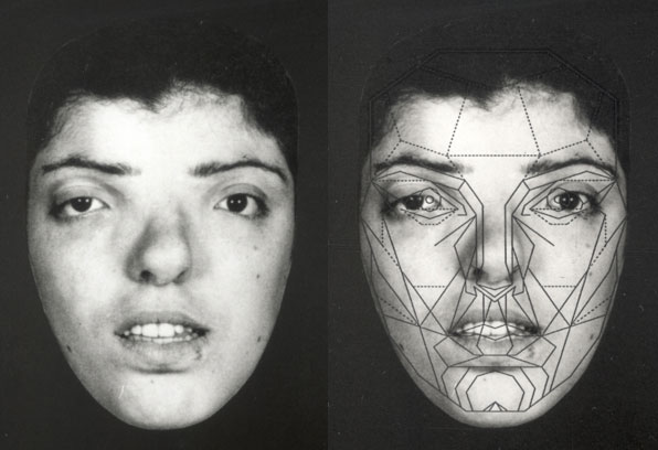
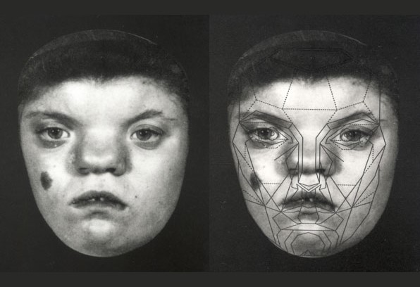
She’s so beautiful. She has a face like a building!
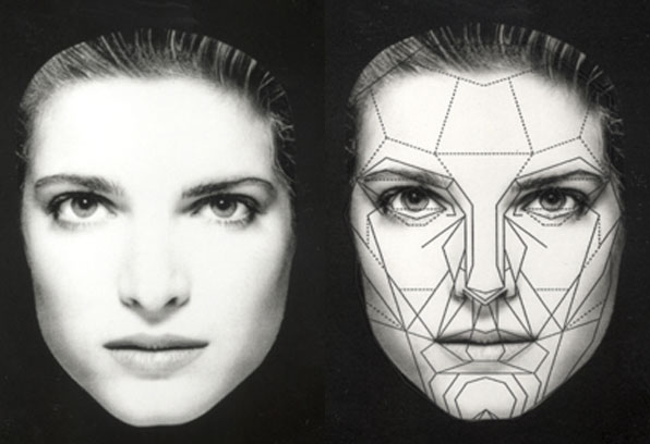
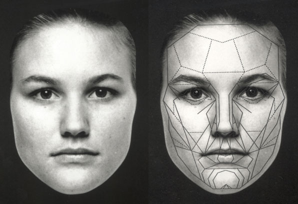
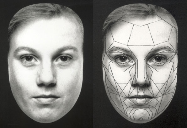
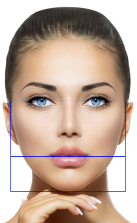
The first failure point was in assuming that a methodology used to evaluate human facial beauty could be applied to cars and buildings. Humans may all look uniquely different, but they all have the very same basic facial structures, and positions and proportions of their features. That’s what makes us look human! Even small changes in the relative positions and proportions of facial features will result in a universal perception of their unattractiveness, and even deformity. This is illustrated by the facial images below, with each face showing their conformity to the golden ratio-based Marquardt Beauty Mask:
By contrast, there is no universal standard that defines the specific features, positions and proportions for the design elements of a car or a building. We know exactly where to expect to find the nose on a human face. A car’s emblem though can appear in the middle of the grill or the top of the hood and look equally fine. We know exactly where to find the mouth on a human face, and know there will be just one. A car though can have a single large grill or separate upper and lower grills and still look perfectly fine. So with these variations in design, there is no reason to assume that a mathematical model that measures for human facial attractiveness is going to produce reliable results in determining the attractiveness of the front end of a car.
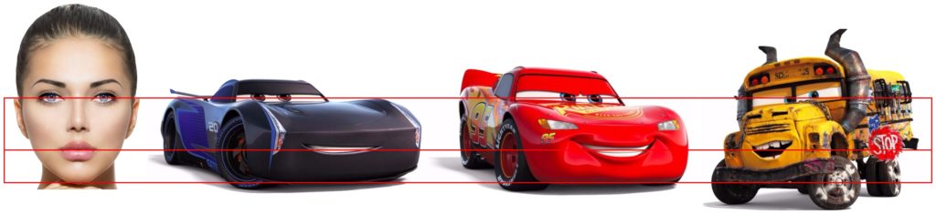
Anthropomorphism – Making non-human things look human!
Humans though have an innate tendency to attribute human traits, emotions, or intentions to non-human entities. This is called anthropomorphism. So yes, with cars it’s very natural to envision the similarities of eyes to headlights, noses to emblems and mouths to grills. This tendency is what Disney Pixar relied upon to create their lovable Cars characters. But the animators at Disney Pixar knew enough about faces and beauty to NOT use the headlights as eyes. Instead they made the cars look human, natural and aesthetically pleasing by putting the “eyes” within the windshields. They then positioned a grill for the mouth at the golden ratio point between the eyes and the bottom of the car’s “face.” This is the very same golden ratio point that defines the position of the mouth on a human face, between the pupils of the eyes and the bottom of the chin! Do you see how the golden ratio proportions of design were applied to all the images below?
But do buildings have human features???
So what about buildings? Here the analogy to human features completely falls apart. There is nothing at all about a building that you would necessarily expect to resemble two eyes, a nose and a mouth. Windows could be eyes, but most buildings have too many to make the connection. You might think of the door as a “mouth.” Doors though can be of any number, and be positioned in the middle, off-center or at the ends of a building. Some buildings have two separate entrance and exit doors on opposite ends. So when it comes right down to it, there is nothing about the design of a building that we should expect to be analogous to the design of a human face. And therefore, there is no reason that we should think that a mathematical model that measures human beauty would be able to measure the beauty of a building. This is most likely why the “best” score achieved by a building in this study was only a failing grade of 72.88%.
And unlike faces, which we can expect to be substantially the same in basic appearance and proportions, architects take great pride in creating something new and different with important, high-profile buildings. Each building must be uniquely designed to meet different functional requirements, to fit within the context of its environment and to convey a message of its style or purpose.
So where are the golden ratios in building design?
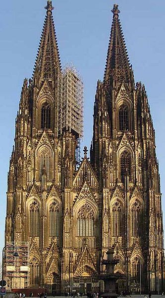
Even if an architect consciously and religiously applies the golden ratio to every possible decision made on position and proportion, there is no reason to think that these design elements will align to the very simplistic set of markers used in the Roofing Megastore study. Let’s look, for instance, at St. Paul’s Cathedral, which earned the number one spot. It actually appears to have some golden ratios in its design. This is shown by the red, green and aqua rectangles divided at their golden ratio points:
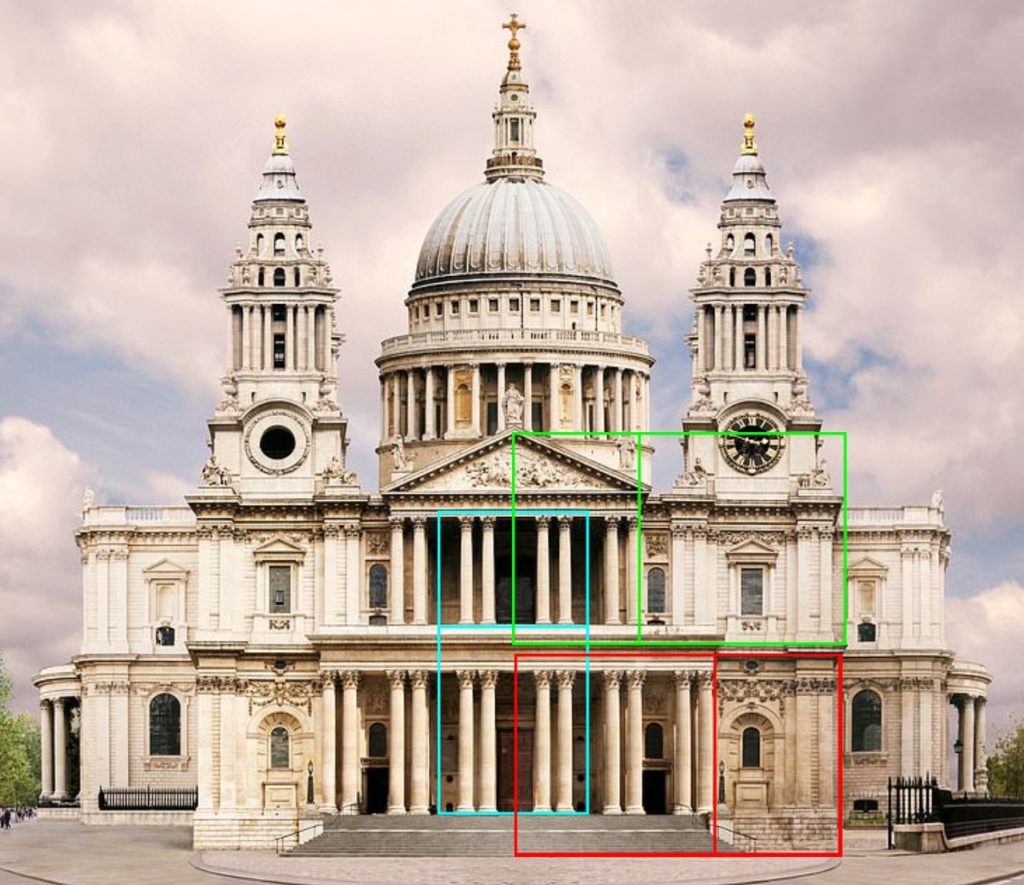
Unfortunately, the simplistic one-size-misfits-all template used to identify building markers in the Roofing Megastore study didn’t recognize the important golden ratio markers on this cathedral. Note the golden ratios based on the outside of the front sets of columns. These were not identified in the study as markers.
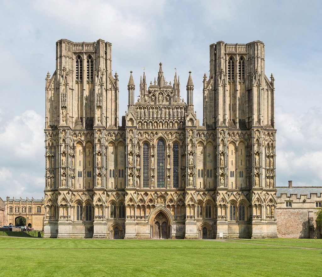
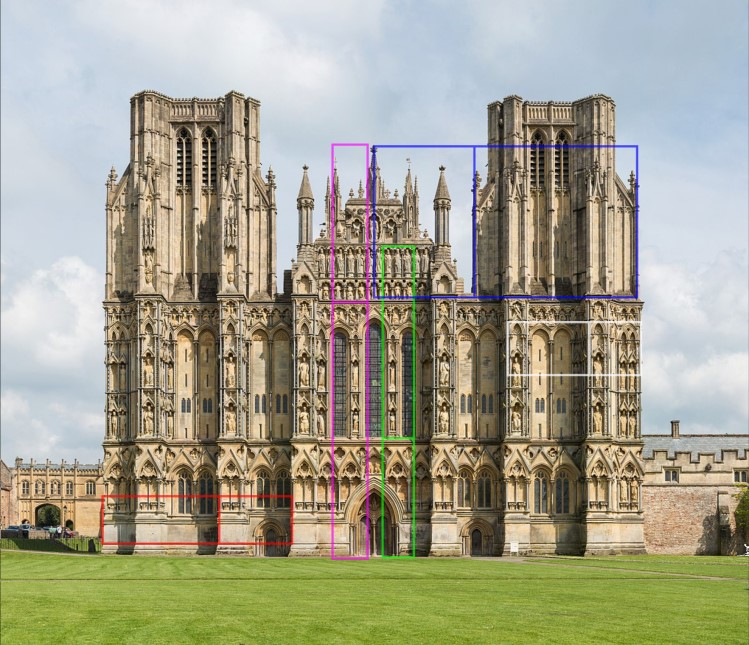
Below is Wells Cathedral, also in England, showing a number of actual golden that appear to have been designed into its beautiful architecture. The set of markers though are different, illustrating that you have to approach golden ratio analysis with an understanding of each building, and not one standardized template.

The same issue undoubtedly happened with most of the other buildings in the study. Accordingly, the results of the Roofing Megastore study likely do not truly reflect the golden ratios in the building’s design. Their measure is just a mathematical average of calculations applied to the hundreds of permutations of pairs of line segments based on their standardized markers.
And what is a golden ratio anyway?
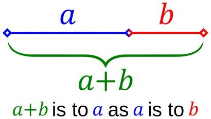
The second major failure point of both the Carwow and Roofing Megastore studies is in an incorrect assumption about the golden ratio. They assumed that any golden ratio proportion between two line segments formed by any three markers would emulate the golden ratio relationships found in nature and in the design arts. This, however, simply isn’t the case. The golden ratio, by its very definition as provided by Euclid in 300 BC, is based on this:
“A straight line is said to have been cut in extreme and mean ratio when, as the whole line is to the greater segment, so is the greater to the lesser.”
This concept is illustrated below:

This same division of a straight line at this one special golden ratio point appears in the proportions of the human face:
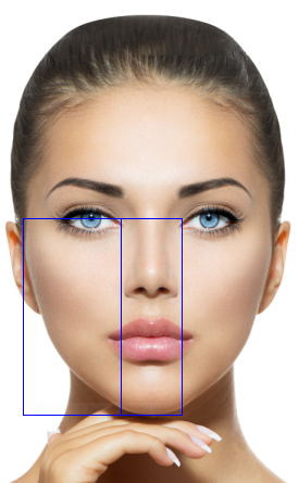
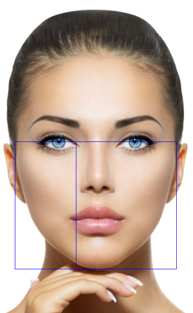
What if we had only achieved 72% accuracy in hitting the golden ratios in the face of the woman above? Her face would be proportioned something like this:

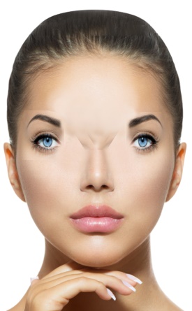
As you can see, a score of 72% is hardly a reliable measure of beauty, in a face, a car or a building.
The Golden Ratio in Logo Design
Look how these same basic golden ratio concepts have been applied in the design of these famous logos:

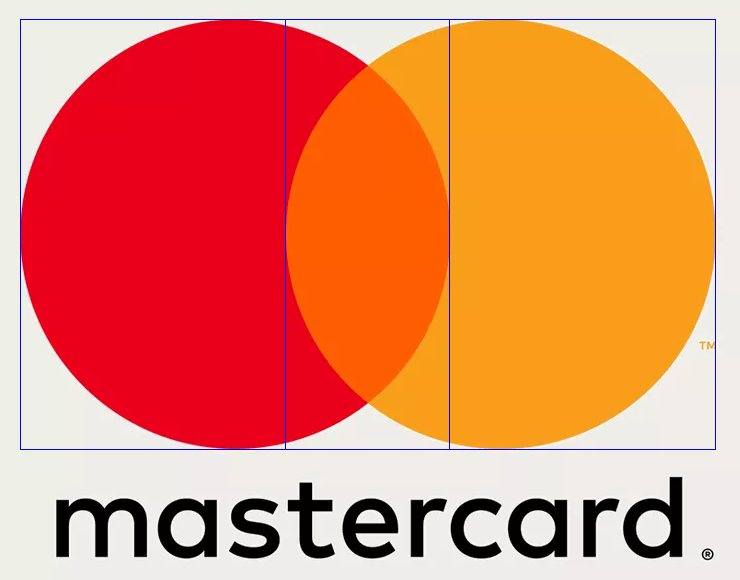
No complicated mathematics with hundreds of permutations on a dozen plus markers was required. In each case, the composition decisions on position and/or proportion of the key elements of the logo simply used the golden ratio point of the logo’s height or width.
The Golden Ratio in Geometry
This same division of a straight line into segments in golden ratio proportion also appears in the geometry of a five-pointed star. Note that multiple golden ratio proportions appear here – in the black to blue lines, the blue to red lines, and the red to green lines:

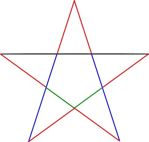
There’s certainly a beauty in the face and in the five-pointed star.
Suppose, however, that I took these golden ratio segments of the star and rearranged them into something very different:

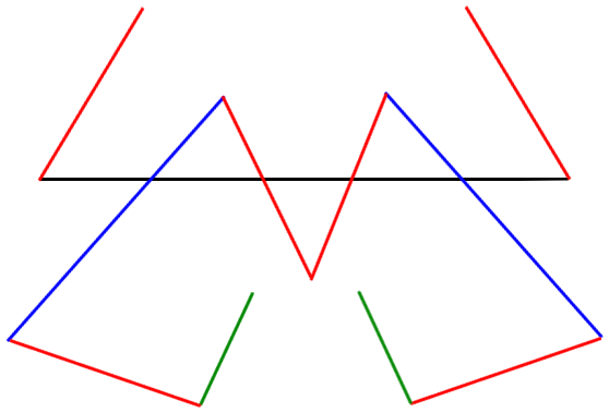
The lines are all the same. The arrangement is still symmetrical, just like the face of a car or building would be. All the same golden ratio relationships exist between the lines. The beauty though of the five-pointed star that was there is now gone. As you can imagine, a beautiful face could also be rearranged and distorted to keep certain golden ratio relationships intact. That face would no longer be beautiful either. Why? It’s because the golden ratios that had defined beauty are no longer discernible by the human eye.
The Golden Ratio in design is all about visual aesthetics, not just mathematical calculations.
Unfortunately, the approach used in these studies replaced simple visual aesthetics with complicated mathematical mumbo-jumbo. This is what both Carwow and Roofing Megastore did in taking their measurements and then doing their calculations and ratings. They did the math, and did it very well. They missed though the very critical fundamental concept of the beauty that is associated with golden ratio. It is simply based on dividing a straight line at the one very unique point that gives it the familiar and pleasing aesthetic that we see in nature, geometry and the arts. The beauty that comes from the golden ratio is based on the visual aesthetics it produces in the human mind.
Whether it’s a face, a logo, a car a building or anything else, it’s critical to to understand the markers that give rise to the golden ratios. The Parthenon, the Taj Mahal, Notre Dame and the UN Secretariat Building all have beautiful golden ratios in their designs. The markers though that define where these golden ratios exist are different for each building. You can’t just make up one simplistic, generic set of markers. You can’t calculate the ratios of every possible permutation of two lines that can be created by each set of three jumbled markers and proclaim that the cars or buildings whose average comes the closest the number 0.618 are the most beautiful according to science and the golden ratio.
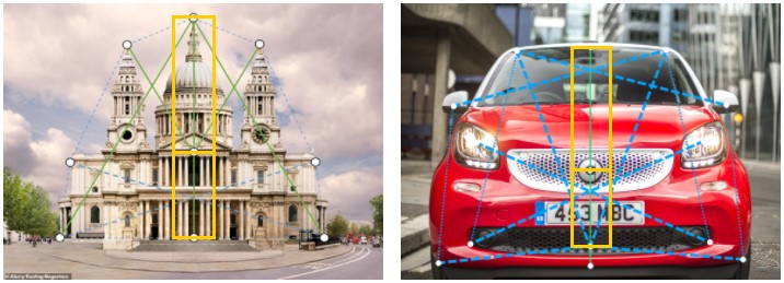
Look at the set of markers and line segments chosen for both the car and building analysis. There is only ONE straight line among ALL the line segments created by the markers. In both cases, that is the straight line from the top center to the bottom center. In both cases, for the objects rated “the most beautiful” there is a marker in between those two points that actually comes quite close to the golden ratio, as shown by gold grid below. This as the ONLY possible actual golden ratio point among ALL the line segments these studies analyzed. These studies were thus set from the start to produce results that had little to do with beauty as actually defined by the golden ratio.

Sharing the true beauty of the Golden Ratio in design
The good people at Carwow, Roofing Megastore and Propellernet (the marketing agency behind these studies) have all been a delight to work with in providing information for my analysis. They all tried very hard to make a legitimate attempt to use the golden ratio to identify the most beautiful examples of design in their respective industries. I applaud them for their creativity and effort. I truly wish I could do the same for their methodologies and results. I’ll be very happy to change my article if anyone can show my assessment to be inaccurate or incomplete.
I’ll also be very happy to consult with anyone conducting a golden ratio analysis of beauty. It should be performed in a way that is truly scientific in its methods and truly meaningful in its results. Golden ratio analysis isn’t difficult in concept. It does though require of experience and knowledge of its appearances and applications to avoid invalid methods and incorrect conclusions. Let’s use studies like these as an opportunity to educate rather than misinform people about the golden ratio. Let’s demonstrate how it is used to achieve beauty in aesthetics and design, so that people can use it to create more beauty, in their lives and in our world.