
“Without mathematics there is no art,” said Luca Pacioli, a contemporary of Da Vinci.
Just as the Golden Section is found in the design and beauty of nature, it can also be used to achieve beauty, balance and harmony in art and design. It’s a tool, not a rule, for composition, but learning how to use it can be a great Art 101 lesson on laying out a painting on a canvas.
For those with a deeper understanding yet, the golden ratio can be used in more elegant ways to create aesthetics and visual harmony in any branch of the design arts. As you’ll find in the examples below, it has been used by some of the greatest artists the world has known.
Oddly enough, you may also find critics who say that the golden ratio cannot be found in art at all. Such statements often come from Ph.D.s in mathematics who hold a very theoretical viewpoint that nothing in the real world can be a golden ratio. Why? Simply because it has an infinite number of digits. (See a review/rebuttal on art and architecture and design.) Pi does too, so this way of thinking says there are no circles in the real world either. For the rest of us, practical applications of mathematical concepts are a simple and necessary everyday occurrence in the arts, engineering and applied sciences.
Leonardo da Vinci
The Golden Section was used extensively by Leonardo Da Vinci. Note how all the key dimensions of the room, the table and ornamental shields in Da Vinci’s “The Last Supper” were based on the Golden Ratio, which was known in the Renaissance period as The Divine Proportion. The lines showing Da Vinci’s intricate use of the Divine proportion were creating using PhiMatrix golden ratio design and analysis software:


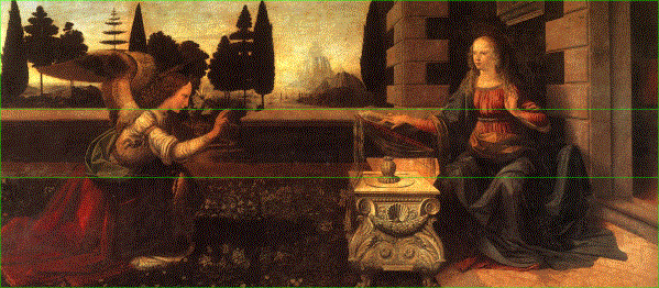
Note in Da Vinci’s “The Annuciation” that the brick wall of the courtyard is in golden ratio proportion to the top and bottom of the painting:

Even the fine details of the emblems on the table appear to have been positioned based on golden proportions of the width of the table:
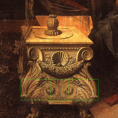

Other golden proportions can be found in “The Annunciation” that illustrate the point and give evidence of Da Vinci’s intent. See other examples of Da Vinci’s use of the Divine proportion here and my article on the beautiful golden ratios in his painting “Salvator Mundi.” The golden ratios that Leonardo da Vinci used in the composition of this painting are explored in the video below:
Select 720p from the settings (gear) icon to see it in full HD resolution.
Click on HERE to go directly to HD resolution on YouTube.


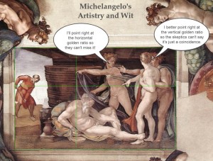
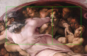
Michelangelo
In Michelangelo’s painting of “The Creation of Adam” on the ceiling of the Sistine Chapel, look at the section of the painting bounded by God and Adam. The finger of God touches the finger of Adam precisely at the golden ratio point of the width and height of the area that contains them both. Alternatively, you can use the horizontal borders of the width of the painting and get the same result. See my separate article revealing Michelangelo’s use of over two dozen golden ratios in his composition of the paintings on the Sistine Chapel. Click on the photos below to see a larger version of the sample images.

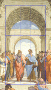
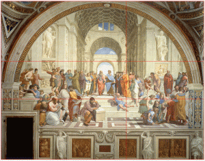
Raphael
Raphael’s “The School of Athens” provides another wonderful example of the application of the golden ratio in composition. A small golden rectangle at the front and center of the painting signals the artist’s express intent in the use of this proportion. We find that Raphael used golden ratios throughout the painting, giving it a wonderful visual harmony.
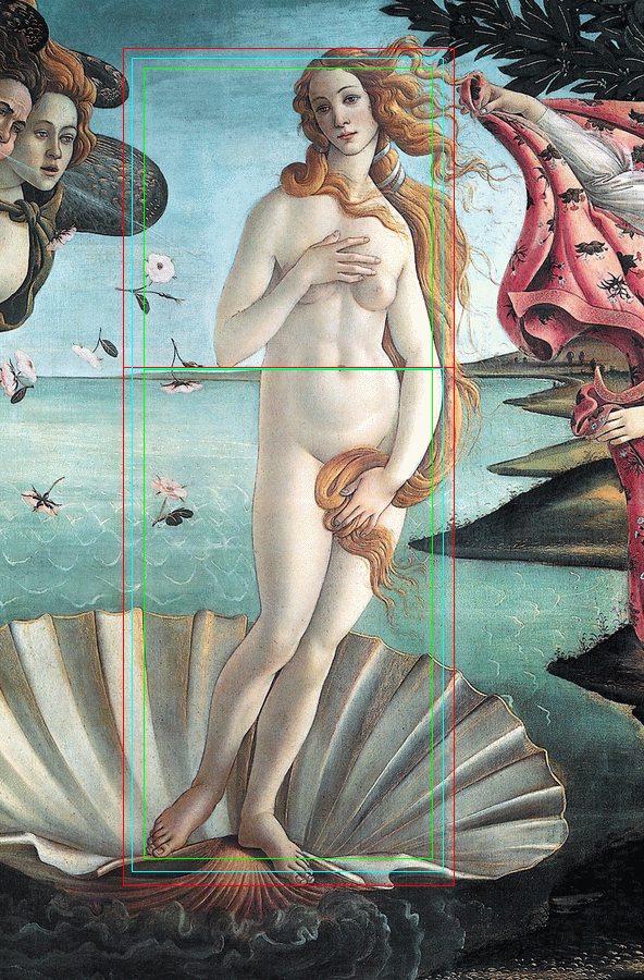
Botticelli
Some say that Bottocelli composed “The Birth of Venus” such that her navel is at the golden ratio of her height, as well as the height of the painting itself. Some argue this isn’t the case. Close examination shows that you can take the golden ratio point using several different logical variations, and they all come to her navel, as well as the bottom tip of her right elbow:
- Red line – From the very top of her hair to the bottom of her lower foot.
- Green line – From her hairline at the top of her forehead to the bottom of her upper foot.
- Blue line – Her height, as measured from the middle of the feet to the top of her head at the back of the part in her hair.
Perhaps a coincidence in composition, but then again perhaps not. See a more extensive analysis yet of golden ratios in The Birth of Venus. The best evidence is that the canvas itself is a golden rectangle, with the ratio of its height to its width in golden ratio proportion. The dimensions of the canvas is 172.5 cm × 278.5 cm (67.9 in × 109.6 in). The width to height ratio is 1.6168, a variance of 0.08%, only 1/20th of an inch, from the Golden Ratio of 1.618.
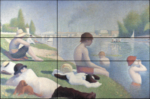
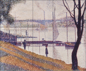
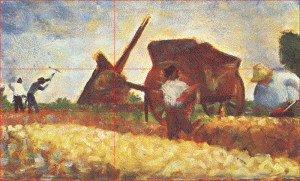
Seurat
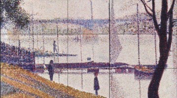
The French impressionist painter Georges Pierre Seurat is said to have “attacked every canvas by the golden section.” In the examples, below the horizons falls exactly at the golden section of the height of the paintings, as are other key compositional elements of the paintings. A more detailed analysis and commentary with dozens of other examples is provided on page Georges Seurat and the Golden Ratio in Art Composition.
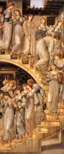
Edward Burne Jones
Below, Edward Burne Jones, who created “The Golden Stairs” (Click HERE for enlarged view), also meticulously planned the smallest of details using the golden section. Golden sections appear in the stairs and the ring of the trumpet carried by the fourth woman from the top. The lengths of the gowns from the sash below the breast to the bottom hem hits the phi point at their knees. The width of the interior door at the back of the top of the stairs is a golden section of the width of the top of the opening of the skylight. How many more can you find?
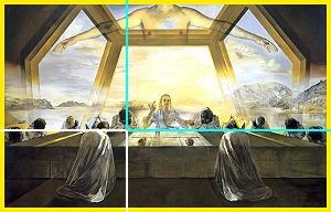
Salvador Dali
In “The Sacrament of the Last Supper,” Salvador Dali framed his painting in a golden rectangle. Following Da Vinci’s lead, Dali positioned the table exactly at the golden section of the height of this painting. He positioned the two disciples at Christ‘s side at the golden sections of the width of the composition. In addition, the windows in the background are formed by a large dodecahedron. Dodecahedrons consist of 12 pentagons, which exhibit phi relationships in their proportions (see the Geometry page for details).

Note: Insights on the use of the Golden Section by Seurat and Dali were provided by Jill Britton.
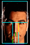
Art 102 – Painting faces like Da Vinci instead of Picasso … or “Why so long in the face?”
Many art teachers and books will tell you that a face can be drawn by dividing the face in halves and thirds, as follows:
- Draw a horizontal line halfway between the eye line and the bottom of the chin. This is the nose line.
- Draw a horizontal line one-third of the distance below the nose line and the bottom of the oval. This is the mouth line.
That’s a nice approximation, but if you want your faces to have both reality and beauty, use phi. More information on the pervasive appearance of phi in the human face is presented on the Face page, but look at the subtle difference this creates in the length of the nose and overall facial proportions:

By the books
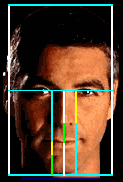
Reality
The mathematical differences in the two approaches are small, but enough to make a noticeable difference:
|
This explains why portraits drawn “by the books” sometimes look a little “long in the face.”

Image source: www.dickblick.com