New Google logo design finds visual harmony using the Golden Ratio.
![]()
Google’s design follows in the footsteps of Leonardo da Vinci and other masters
When Luca Pacioli published “The Divine Proportion” in 1509 (with illustrations by Leonardo da Vinci), he described his work on this “golden ratio” of 1.618 as a “very delicate, subtle and admirable teaching” that would “delight in diverse questions touching on a very secret science.” Johannes Kepler later called it “a precious jewel” of geometry. The designers at Google have apparently found its value too, as we see when we study and appreciate the underlying design of Google’s new logo, iconic G, the microphone icon and even the layout of the Google search page.
This is the kind of thoughtful design work that follows in the footsteps of Leonardo, Michelangelo, Raphael, Botticelli, Seurat, Le Corbusier and other masters of design, and that would make Pacioli proud.
Here’s a version without the arrows for a clearer view:
![]()
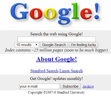
There’s a good chance you’ve used Google to search the Internet lately, maybe even in getting to this site. With over a billion people visiting per month, Google obviously puts in a lot of thought to create the best possible experience in using their search page. As simple as it is, the design of the logo and its search page has evolved considerably over the years. Consider how Google looked in 1998:
Logos and trademarks are critically important to a company’s image and brand recognition. On September 1, 2015, Google announced the new design for its logo and other trademarks. Their ongoing refinements of the logo and related design elements have led to the use the Golden Ratio (GR) in its design.
Golden ratios in the new logo and symbol are revealed by graphic analysis
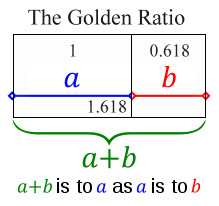
For those not familiar with the golden ratio, it’s a simple as this:
- Divide a line into two segments, a and b.
- The ratio of the longer segment a to the shorter segment b must be the same as the ratio of the original line (a+b) to the longer segment a.
- That unique dividing point is the “Golden Ratio.”
The grid lines shown on logos in this article represent the golden ratio(s) of the height or width shown by the grid:
Let’s now see how the Golden Ratio appears in this new design, aided by the pixel-level accuracy of PhiMatrix design and analysis software:
- The height of the lower case letters is a GR of the height of the capital “G.”
- The upper point on the right side of the “e” is a GR of the height of the lower case letters.
Next, take the height of the letters from the top of the upper case “G” to the bottom loop of the lower case “g”. Note alignment with the golden ratio lines at:
- The upper line of the crossbar on the upper case “G.”
- The inside edge of the lower case “o”, “g” and “e”.
- The pointed tip on the bottom curve of the lower case “e”.
![]()
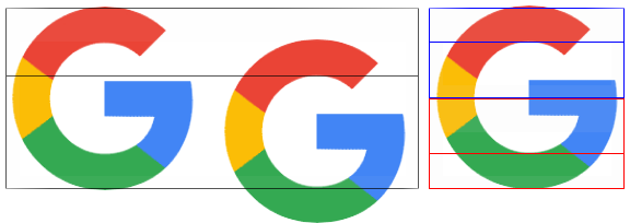
The new Google G symbol
The new Google “G” symbol also closely aligns with the Golden Ratio in it’s design:
- Horizontally – The bottom of the crossbar of the “G” and the inside point of the green arc align with the GR lines horizontally.
- Vertically – The inside points of the red and green circles fall at vertical GR lines of from the center of the “G” to the right edge of the “G”.
![]()
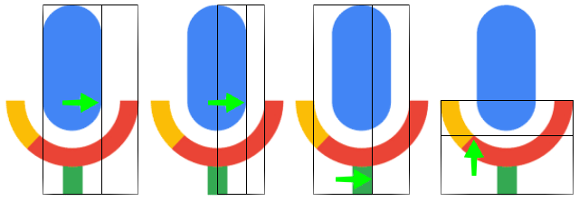
The new Google microphone symbol
My analysis reveals that new Google microphone symbol has a surprising number of golden ratios that were taken into account in its simple but very elegant design:
- The blue microphone is a GR of the inside and outside diameters of the circular arc the surrounds it. (Images 1 and 2)
- The width of the microphone stand is a GR of the width of the inner diameter of the circular arc. (Image 3)
- The point at which the color changes from gold to red appears at a GR of the height of the circular arc from the base of the stand. (Image 4)
These are quite intricate design decisions for such a small icon. Think though how it ever so subtly relates it to the logo above it. It creates visual harmony by using same proportions for the design of all the elements of the composition. These same techniques appear in the composition of paintings and buildings by recognized masters of design, back to the Renaissance and before.
Golden Ratios throughout the new font created for letters in the logo
We also find the golden ratio in use in the width of the letters and other fine detail of the new font that Google calls Product Sans. Look at the width of the letters in relationship to each other.
- The width of the lower case “g” is a GR of the upper case “G”.
![]()
- The width of the lower case “l” is in GR proportion to the lower case “g”:
![]()
- The points on the lower arc of the lower case “g” are also based on Golden Ratios:
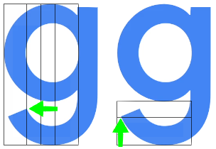
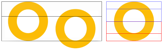
- The diameter of the hole inside the “o” is a GR of the height of the “o”. That in turn makes the line thickness of the “o” a GR of the radius of the hole.
- The capital G for the Google icon was designed with exactly the same approach:
The PhiMatrix grids used above make this kind of design easy to do. For those just itching for a little math at this point, here’s how this works:
- When the diameter/height of the outer circle for the “G” and “o” is the Golden Ratio of 1.618, the diameter/height of the hole inside the circle is 1.
- This leaves 0.618 remaining for the line thickness of the font above and below the hole.
- The line thickness of the font is thus half of that at 0.309.
- The radius of the hole is 0.5.
- The ratio of 0.5/0.309 is … 1.618 again!
It’s the unique mathematical properties of the Golden Ratio that makes this relationship happen … again and again and again …, and why it is so useful in achieving visual harmonies in design.
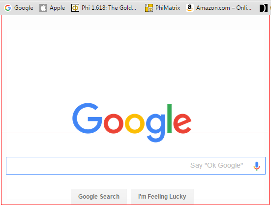
Google Search Page design layout
Google didn’t stop there. Look at the proportions of the Google logo and search bar:
- The center of the Search bar is positioned at the golden ratio of the distance from the top of the Google logo to the bottom of the “Google Search” and “I’m Feeling Lucky” buttons:
- The bottom of the Search bar is positioned at the golden ratio of the distance from the top of the Search bar to the bottom of the “Google Search” and “I’m Feeling Lucky” buttons:
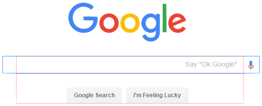
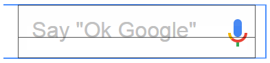
And where are the letters positioned within the search box and buttons? At this point, it probably wouldn’t surprise you to see:
- “Ok Google” and the bottom of the microphone at the GR of the height of the search box, and
- “Google Search” and “I’m Feeling Lucky” at the GR of the height of their respective buttons.
The Google logo is positioned very closely to golden ratios of the distance from the top of the browser window to the various components of the search box:
- The top of the logo is at the GR from the top of the browser window to the top of the search bar.
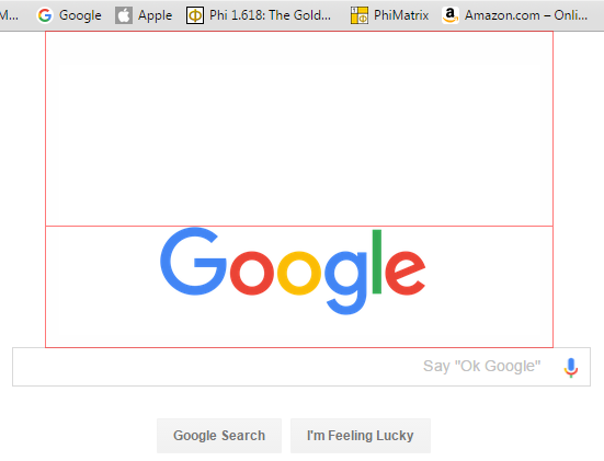
- The top of the lower case letters of the logo is at the GR from the top of the browser window to the bottom of the search bar.
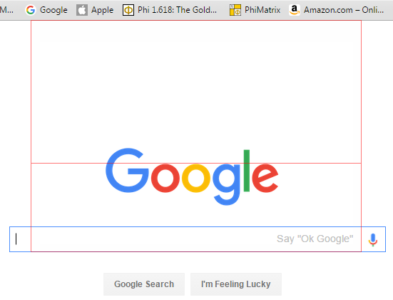
- The bottom of the lower case letters of the logo are within several pixels of the GR from top of the browser window to bottom of the “Google Search” and “I’m Feeling Lucky” buttons:
Graphic analysis and composition with pixel-level accuracy
The above analysis was done with PhiMatrix analysis software, which makes it easy to identify and apply Golden Ratios in design and composition with pixel-level accuracy. Golden ratios allow proportions to be kept in consistent visual and mathematical harmony, unlike any other ratio. Beyond its unique mathematical properties, the appearance of the golden ratio in nature and the human face leads most people to find it natural and pleasing.
This importance of this is highlighted by Darrin Crescenzi in his excellent article, “Why the Golden Ratio matters. In defense of using visual harmonies in Design.” Darrin is Design Director of Innovation at Interbrand New York, frequently quoted in FastCo Design as an authority on design and one of Fast Company magazine’s 100 Most Creative People in Business.
Google used the Golden Ratio in its previous logo design and search page layout
This is not the first time that Google has used the Golden Ratio in its design. The website design they just replaced had GR in both the logo and the layout of the page. In the previous logo:
- The height of the lower case letters were a GR of the height of the upper case “G”.
- The right point of the “e” was slightly higher at the midpoint of the lower case letter height.
- The crossbar of the upper case “G” though was notably lower, and positioned at the GR of the height of the lower case letters, rather than at the midpoint of the height as in the new logo.
![]()
The width of the crossbar of the upper case “G” is a golden ratio of the width of the “G”.
![]()
![]()
The lower portion of the lower case “g” is a golden ratio of the height of the lower case letter as well!
![]()
The design of the Google Search Engine page layout embodied the Golden Ratio
The previous Google search engine home page also based its layout on the golden ratio in a slightly different way, as shown in the images below.
From the top of the browser window to the top of the logo to the top of the search box:
![]()
From the top of the logo to top of the search box to the bottom of the buttons:![]() From the top of the search box to top of the buttons to the button of the buttons:
From the top of the search box to top of the buttons to the button of the buttons:![]()
It may be just a tool, but the Golden Ratio has broad appeal and application
No matter what kind of design you do, the golden ratio offers a reliable way to achieve a natural balance and aesthetically pleasing appearance in design. It’s much more than just a more natural and accurate alternative to the rule of thirds. It’s a mathematically unique system of ratios within ratios that can keep an entire composition in visual harmony. See many other examples of the golden ratio in design of art, architecture, logos and products.
It’s just one of many tools that good designers use to achieve great composition, but no designer should be without a knowledge of its concepts and application. At least that’s what the graphic design team at Google seems to think, and more than a few great masters of design through the centuries.
Author background
Since the 1990’s, Gary Meisner has been researching the appearances of the golden ratio in the beauty and nature, and its application in the design arts. He created www.goldennumber.net in 2001, which reaches 1 million people per year and shares contributions from dozens of others from a variety of backgrounds. He is the developer of PhiMatrix Golden Ratio Design and Analysis software, which is used in over 70 countries. He has connected with thousands of other people with common interests in the topic, sharing with them and learning from them. His interviews on the topic have included the LA Times, a TV educational documentary and radio.
References:
Google Official Blog Page on Logo Redesign
Google Official UK Blog Page on Logo Redesign
Google unveils new logo at turning point in company’s history by The Guardian
Can you design a better Google logo? by the Guardian
Short link to this post: http://goo.gl/91fCk3

Thanks for your info about a “google” letter and another tool from google with a Golden Ratio equation whathever the google designer create it with a concious or unconcius “Art Sense”. I know when a Golden Ratio / a God Number actually appeared at a lot of famous logos like Toyota, Apple, National Geographics yellow square, etc………. and even a Christ Cross. I wait your explanation about Golden Ratio in the human face more detail rather than Dr Marquardt himself. Dr Marquardt discovered, not create said Dr Marquardt in discussion in Journal of American Orthodontic, a Golden Facial Masks both repose frontal and lateral by a Golden Pentagon – Decagon matrix with a strong scientific evidence like 1 + 1= 2 who can’t be denied with another skeptic people maybe because they are so stupid / stubborn and feel they are ugly / lower average looking. Of course no and never a biological basis like human face – body an even a Nautilus Shell shape are perfectly fit or mached with a geometrical basis like a Rational Ratio ( Vitruvian Man ) and a Golden Ratio 1:1,618009……… Because a geometrical basis are represented an ideal and perfect shapes.
This is absolutely Fantastic! I am updating my HS Geometry Adventure wikispace (website enclosed)
and will add this link as soon as I send you this appreciative comment…
I will add more of your pages ongoing: what a great find for students and teachers.
Thank you Mr. Gary Meisner!
What did the designers say to that?
Wow, u really put an effort on studying anything that can relate to golden ratio.! Wonderful
Besides golden ratio in design of art, architecture, logos, products, nature and human proportion, can it relates to our 24 hours daily time? (from morning, work, lunch then sleep again) i mean is there a balanced idea or harmony based on the golden ratio base on 24 hours time daily, that could be ideal for human? Maybe someone else asked this already?
The golden ratio would divide the 24 hour day into two segments of 14.8 hours and 9.2 hours. The 9.2 hour segment is more than a typical sleep cycle, but is perhaps representative of a typical work day when considering 8 hours of work time plus time for lunch and/or commuting time. The 9.2 hour segment could also be typical of the time required for sleep plus the activities that precede and follow it for showering, brushing teeth, dressing, etc. That leaves us with 5.7 hours a daily for other activities that we wish to pursue. Not a bad model.
Ive tought Byron in my many years of teaching in Russia
It’s every where!
This is the divine rule well explained. Thank you!
This is amazing how everything is synchronized in the same sequence
cool
i think this is very fascinating. i really like the Google’s logo. However, would you think if everyone uses the golden portion, then, it will be little bit boring and dull.
The golden ratio is a tool, not a rule, in design. Even if it were imposed as a rule though, there’s no reason to assume that the end result would be boring and dull. That’s like saying that if everyone just uses the twelve notes in the Western scale and applies standard principles of music theory that music will be boring and dull. That’s just not so, is it. The golden ratio is often found in the proportions of a beautiful face, yet we never seen to tire of those either.
Both the golden ratio and musical scales appeal to our natural sense of what is beautiful and harmonious. This is probably hard-wired into our perceptions, but is also grounded in the unique mathematical relationships they employ. Part of their beauty is that they can be applied in an unlimited number of ways, so nothing is boring and dull when creativity is at work.
This applies to applications in design as well. You can have endless variations of great-looking designs all based on the golden ratio. As another example, the golden ratio is applied by a leading character designer for cartoons, and his characters are still always unique, interesting and appealing. See https://www.goldennumber.net/golden-ratio-cartoon-character-design/ for more.
Great point, Gary. As humans we never grow tired of beauty, and therefore we never grow tired of the golden ratio.
Googlồn
I never knew that the golden ratio was used in Google’s logo design, let alone several times. This makes me curious to if and where it is found elsewhere on google’s website and applications. Do other major search engines use or think about the golden ratio in their design too?
Leonardo Da Vinci?
It was Leonardo Fibonacci – a famous Italian mathematician in the 13th century, not an artist from the 15th century.
That’s 200 years and hundreds of hours of studying apart
Not so. The Leonardo of Fibonacci fame never applied his sequence or the golden ratio in any forms of art or design. Leonardo da Vinci, however, applied the golden ratio in his paintings, along with other Renaissance artists.